


Live Love is a premium Wedding and Events Planning Agency, creating and crafting personalized events for each of their clients. Their events have been published in coveted publications and websites and various high profile wedding blogs.
Visual Identity
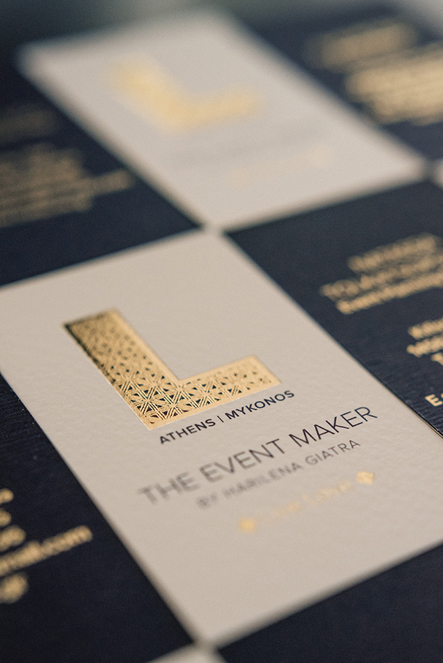
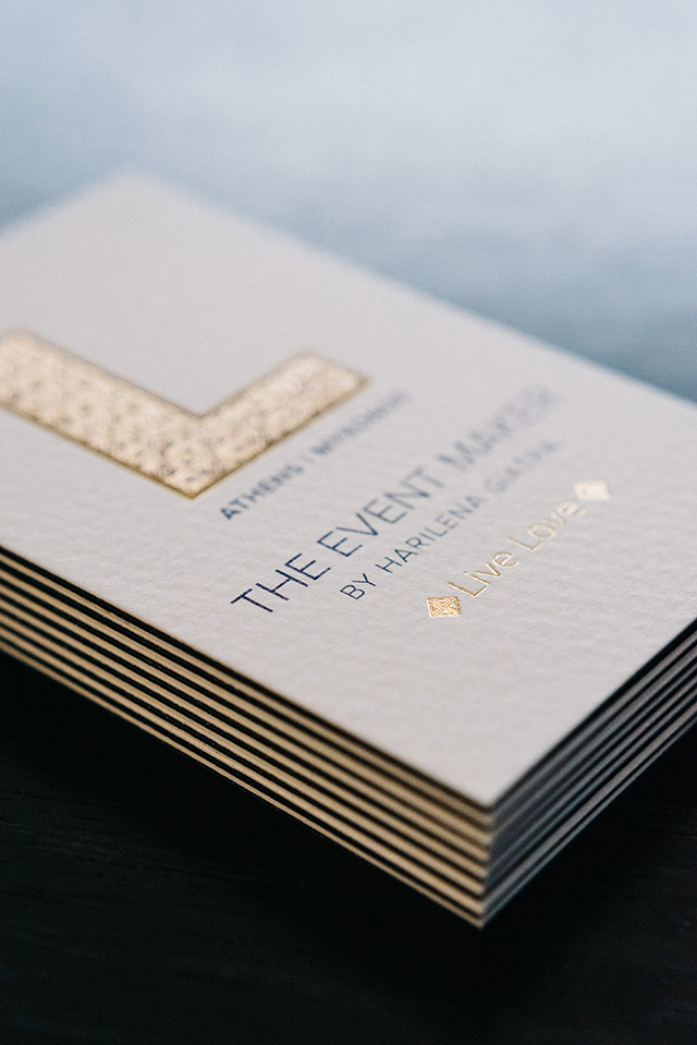
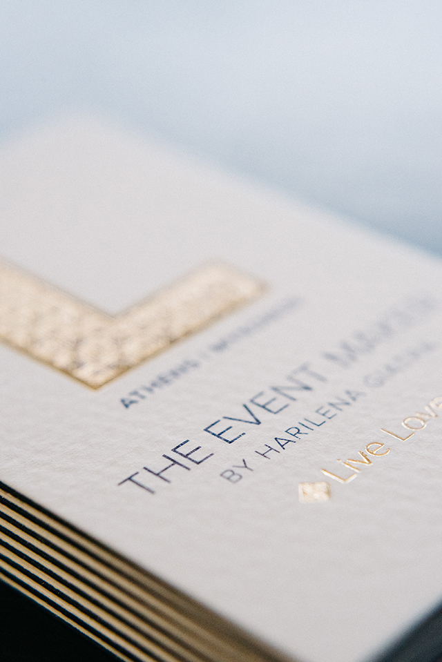
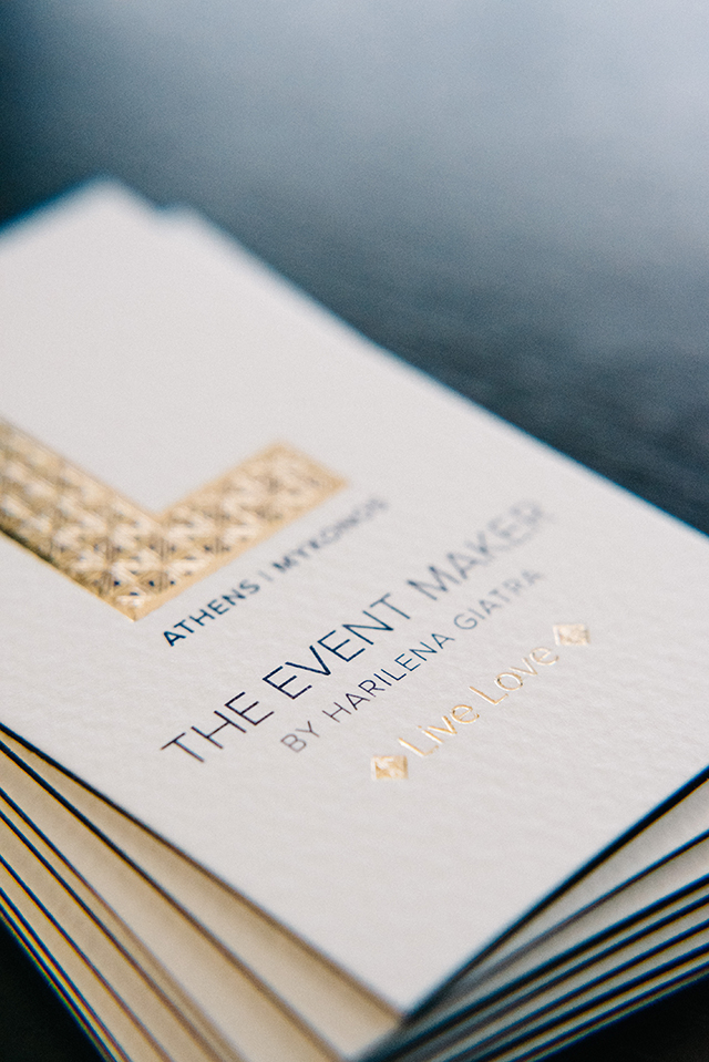
From both an emotive and organizational point of view and during the analysis of the project, it was concluded that the symbol / mark ‘’L’’ represents the philosophy, the emotions and the values of the agency. All of them starting with this letter. Thus, it would work best to demonstrate the multitude of these values. The decision to abandon the classic calligraphy, the soft and feminine tones, was a down to a choice of character, with the intention to best project the premium service offered by the agency. The Color palette: The royal blue, no-frills elegance, embellished only by the gold foil, consolidating the entire project and brand as premium-luxury.